Tenity
Web redesign
Time frame: 10 days
Role: UX/UI Designer
Goal: Redesigning Tenity’s website
What is Tenity?
Tenity helps early-stage startups through accelerator programs and funding opportunities and at the same time works with grow-stage startups, corporates and investors.
EMPATHIZE
MAIN CHALLENGE
The rapid growth of the company has led to a situation where content has been continuously layered without a clear strategy or organization. As a result, there is an overwhelming amount of information that lacks coherence and structure. This has caused confusion among startups, as they struggle to understand what Tenity truly offers and how it can support their needs. Instead of a clear, unified message, they encounter a scattered presentation of services, programs and content that makes it difficult to grasp Tenity’s core value proposition and how it stands out in the market.
I carry out a detection of the main painpoints through a Heuristic Analysis. In this way, I draw up a map of the main weaknesses observed on the website.
Using blue in this choice disrupts the established color code, it breaks with the principle of consistency. Consistent colors are important because they help maintain a cohesive look, guide users, and support the overall design language. Introducing blue unexpectedly can cause confusion, draw attention away from key elements, and make the design feel less unified.
HEURISTIC ANALYSIS
Principle 4. Consistency and standards
Principle 8. Aesthetic and minimalist design
COMPETITIVE ANALYSIS
INTERVIEWS
I conducted interviews to validate whether the painpoints I identified were shared by individuals familiar with the terminology and experienced in the startup ecosystem.
MAIN CHALLENGES/INSIGHTS
Clarity
DEFINE
The footer content is overly large and cluttered without a clear purpose. This not only disrupts the principle of consistency but also goes against the principle of aesthetics and minimalist design. As a key part of the website, the footer appears on every page, and many users rely on it to quickly access sections like Contact, Careers, and more.
I carried out a competitive analysis to see what competitors were doing and how they presented similar work. This helped me understand industry trends, design choices, and messaging strategies. By looking at how others convey similar content, I could identify best practices, find areas where I could improve, and ensure our approach was both effective and distinctive in the market.
To achieve this, I conducted user interviews. Six profiles were selected: four of them were startups currently or previously involved in the Tenity program, while the remaining two were individuals familiar with the relevant terminology but without prior experience with Tenity.
Navigation
PROBLEM STATEMENT
Early-stage startups applying to Tenity's accelerator struggle with the unclear website and hidden information, needing a clearer layout and accessible program details to apply confidently.
USER FLOW ANALYSIS
Through a detailed analysis of the user flow that startups follow on the site, I identified a potential gap that could be causing navigation challenges. The transition between the startup page and the specific programs is not clearly defined, as it does not indicate which programs are tailored to different types or stages of startups. This lack of clarity may confuse users and impede their ability to easily find the most relevant programs for their specific needs. Improving this flow could enhance the overall user experience and make the site more intuitive.
I chose to include a dedicated page that segments the user journey based on the type of startup program. This allows for the offering of tailored programs depending on the location where the startups are based or have an interest.
IDEATE
DECISIONS MADE
Navigation bar
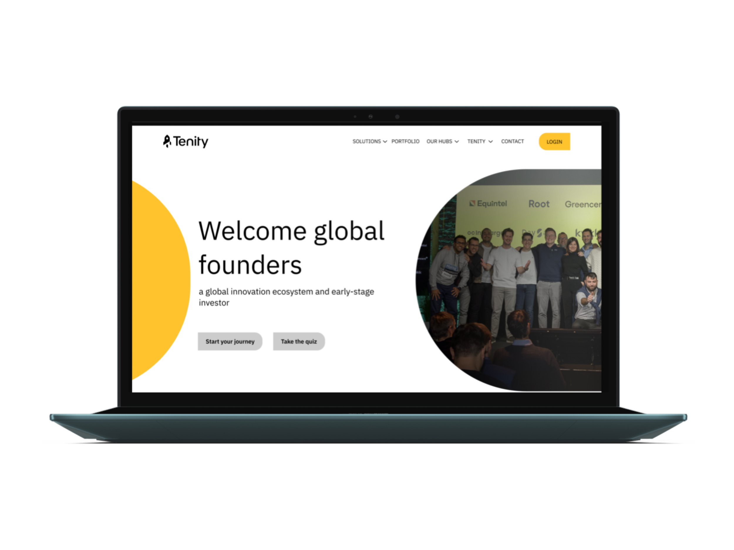
In the redesigned navigation bar, I organized profiles into categories to reduce clutter. I added a Portfolio section, which was previously hidden, inspired by competitors. Additionally, I included a Contact option based on user feedback that highlighted difficulties in finding the right person to address.
Color code
Tenity originally planned to differentiate the various journeys using color. However, with the addition of several new elements to the existing structure, the intended color scheme became lost and no longer fits. I am restoring the color distinctions as they were originally displayed on the website.
Footer
The original footer is too long and uses space inefficiently. Therefore, I have decided to restructure it and combine the information with the newsletter subscription form.
Timeline
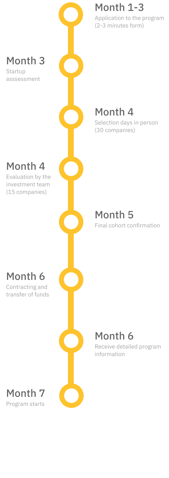
After the uncertainty of the process presented by some users, I decided to introduce a timeline to clearly visualise the moment when the first form is sent and the program starts, as it can take up to 7 months.
Quiz
To improve clarity and structure, I added new pages that weren't initially part of the journey. After testing and reviewing feedback, I realized that the path from the start to the final goal was too complex. To streamline the process, I introduced a quiz at the beginning, allowing users who already know what they need to bypass unnecessary steps and go directly to the goal.
COLORS
PROTOTYPE
The main competitors share some common design elements, particularly in their navigation menus and portfolio sections.
Most competitors have similar menu structures, which makes it easy for users to find what they are looking for quickly and intuitively. This consistency in menu design helps enhance user experience across different websites in the industry.
Additionally, many competitors include a dedicated portfolio tab, showcasing their work or projects. This tab is often prominently placed in the navigation, making it easy for potential clients or customers to explore their offerings and past successes. The portfolio tab serves as a critical element, allowing businesses to highlight their expertise and build credibility with visitors, which is a standard expectation in the industry.
After reviewing the website, it's clear that the main concern of the stakeholder —Startups get confused and don’t understand what Tenity is and how it can help them— is still valid. Overall, the site suffers from a few critical issues:
1. Lack of Consistency in Structure: The website's layout and navigation are not consistent, which can make it difficult for users to find and understand the information they need. Inconsistent design elements and navigation paths can disrupt the user experience and make the site feel fragmented.
2. Lack of Clarity in User Journeys: The paths users are expected to take through the site are unclear and not well-defined. This lack of clarity can lead to confusion about the site’s purpose and how to navigate it effectively. Users may struggle to understand where to go for specific information or actions.
3. Hidden and Repeated Information: Important details are often buried or not easily accessible, while some information is repeated in different sections of the site. This can cause frustration for users, as they might have to search through multiple pages to find what they need or encounter the same information multiple times.
Together, these issues contribute to a confusing user experience… I’m extracting these pain points from the previous review, but let's see if users share the same opinions.
Although initially Tenity used red, yellow, green and blue as primary colors, I decided to recover the original color code, leaving red, green and blue as the colors of the different journeys and yellow as the primary color and call to action.


